Category:
Label and Packaging
Client:
W.R. Grace & Co.
Duration:
2 weeks
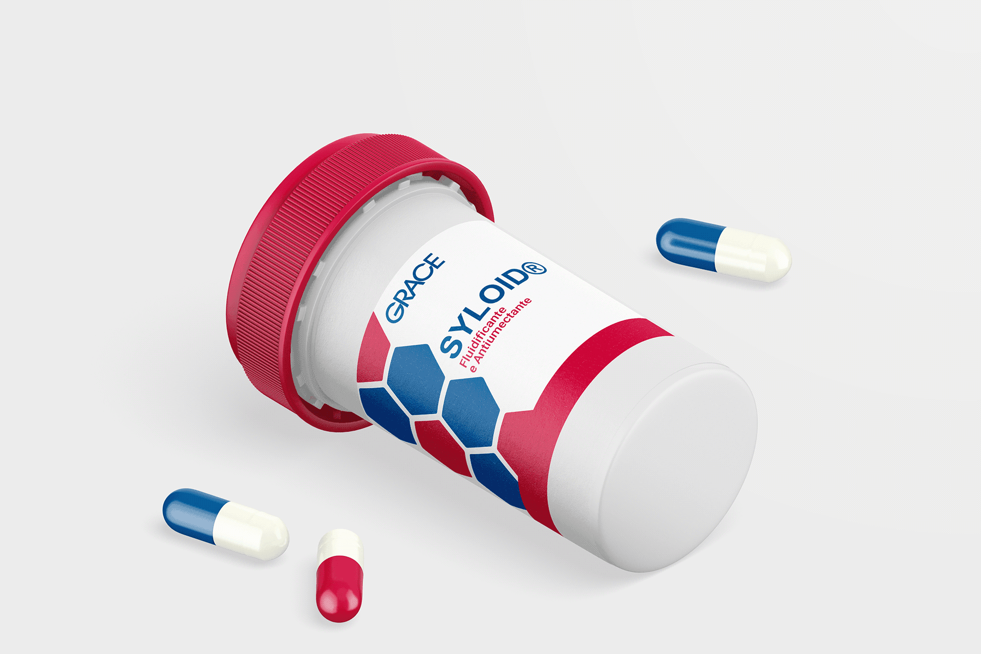
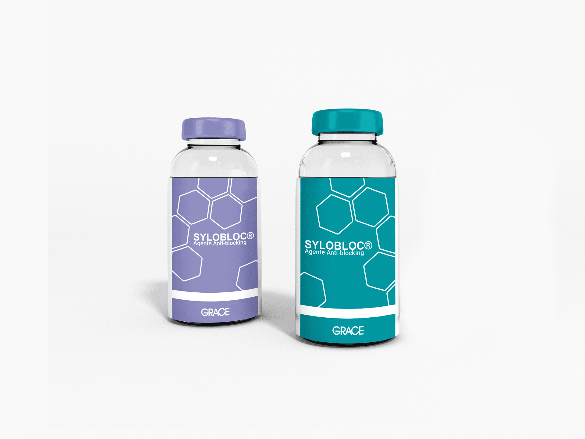
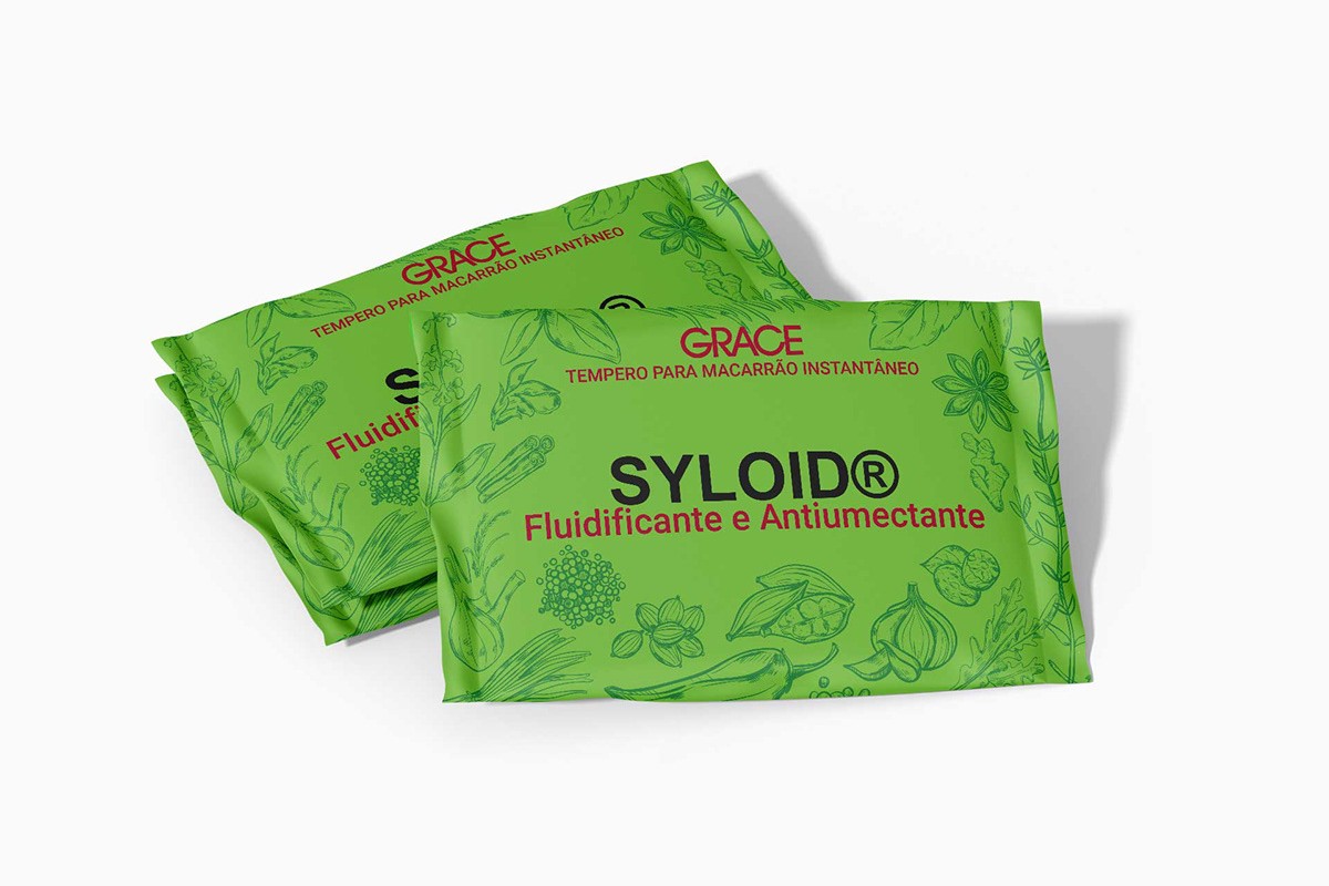
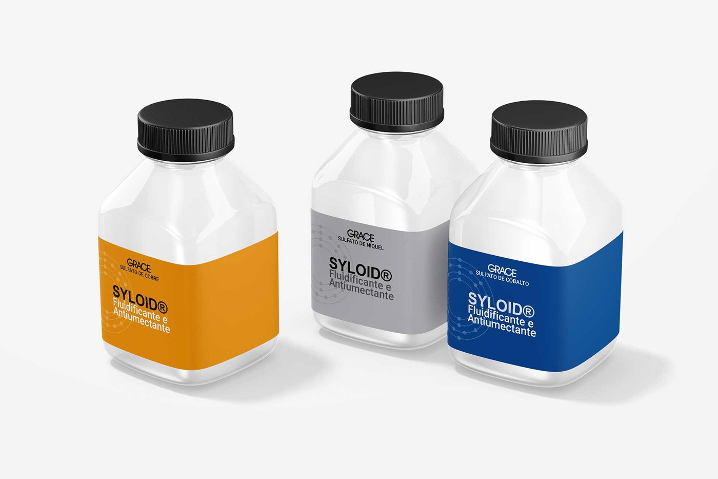
The graphic project was developed for W.R. Grace and Co., a company in the chemical sector specialized in silica. The creation of the labels aimed to highlight the application of the company’s products in various industries. Each label was designed to visually represent the chemical nature of the components and their applications.
(APPROACH)
Our approach to label design focused on simplicity and clarity, highlighting the brand's visual identity and product safety. The colors and geometric shapes were chosen to facilitate the identification of each type of silica and chemical product, bringing a modern and professional touch to the labels.
(VISION AND INNOVATION)
The goal was to communicate, through a strong visual identity, the relevance of Grace's chemical products in the manufacturing process of other commercial items. The labels reflect the company's precision and technology, designed to create a connection between the brand and the professionalism of the industrial sector.
One of the biggest challenges was to create a consistent visual identity based on the company's sober identity for diverse chemical products. Furthermore, it was essential that the design be informative and visually appealing to facilitate the internal exposure of the products. The layout needed to highlight technical information in a clear and organized manner.
(CLIENT NEEDS)
Grace needed labels that highlighted the application and quality of its products for presentation in internal displays. This design was created to attract and inform the company's internal audience about the versatility of the products, strengthening the brand's value in the silica and chemicals sector.
