Category:
Visual Identity
Client:
Arabutã - Organic Coffee
Duration:
4 weeks
Born from the union of tradition and sustainability, Arabutã Coffee carries in its name the ancestral strength of the Tupi language: Arabutã, as the indigenous peoples called the brazilwood - the tree that symbolizes our land. Like the rings of the precious wood that named our country - symbolized in our brand - each layer tells a story of respect for the land and for the people.
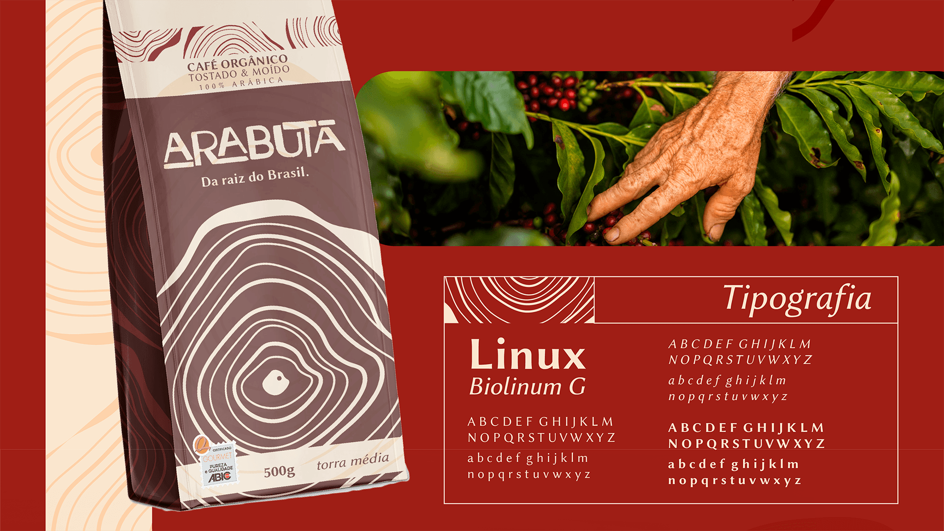
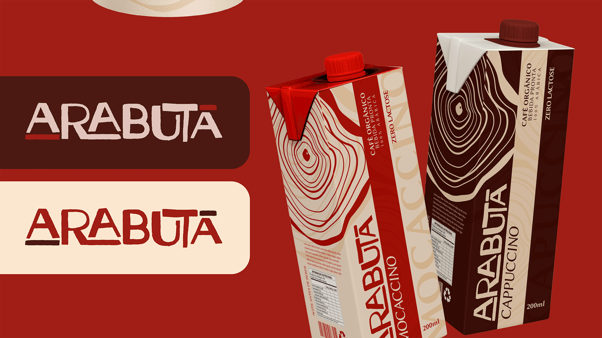
Our visual identity evokes the Brazilian origin of the coffee through concentric circles, which represent both the rings of the brazilwood and the waves formed when tasting exceptional coffee. The earthy red of our palette celebrates the striking color of the wood that names our country, while the raw tone refers to the purity of our selected beans.
Produced in harmony with nature, each Arabutã bean is cultivated under the principles of organic farming and fair trade, generating a positive impact throughout the entire production chain. Our pursuit of excellence results in a gourmet coffee with a unique flavor that honors its roots and looks to the future, cultivating not only coffee but also environmental awareness and social development.
Arabutã is more than just a coffee brand - it is a commitment to quality, to the land, and to the people who are part of this story.
(APPROACH)
As a designer, my approach to the visual identity project of Café Arabutã was based on establishing deep and meaningful connections. When discovering that the name originated from the Tupi word for the Brazilwood tree, the tree that names our country, it became clear that we needed to create an identity that honored this cultural and natural heritage.
The brand rings are not just decorative elements, but rather a symbolic representation of the growth rings of the Brazilwood tree, a direct visual reference to the roots of this coffee. And by coincidence (or not), these same circles refer to the ripples that form when we stir a freshly brewed cup of coffee.
The entire color palette, from earthy red to raw tone, was carefully crafted to reflect the essence of this organic and honest coffee, from cultivation to the cup. Every detail tells a part of the story we wanted to communicate.
(VISION AND INNOVATION)
The vision behind Café Arabutã was to go beyond the simple commercialization of a gourmet product. It was about creating a brand that represented the values of sustainability, social responsibility, and connection to Brazilian roots.
Upon embarking on this project, the main challenge was to translate these concepts visually, without falling into clichés or obvious solutions. We wanted an identity that stood out, inviting the consumer to make an emotional connection with the brand and its purposes.
(CLIENT NEEDS)
The client was looking for much more than just a beautiful design for their café. They wanted an identity that authentically reflected the essence of the project, clearly and impactfully communicating the values that guide the brand.
In addition, it was essential for the visual identity to position Café Arabutã as a premium, gourmet, and differentiated option in the market, without losing its connection to Brazilian origins.


