Category:
Visual Identity
Client:
GeneticaLabs
Duration:
4 weeks
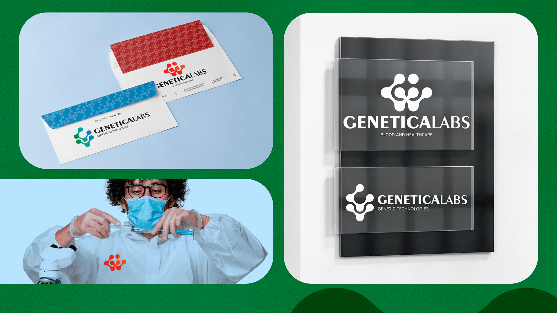
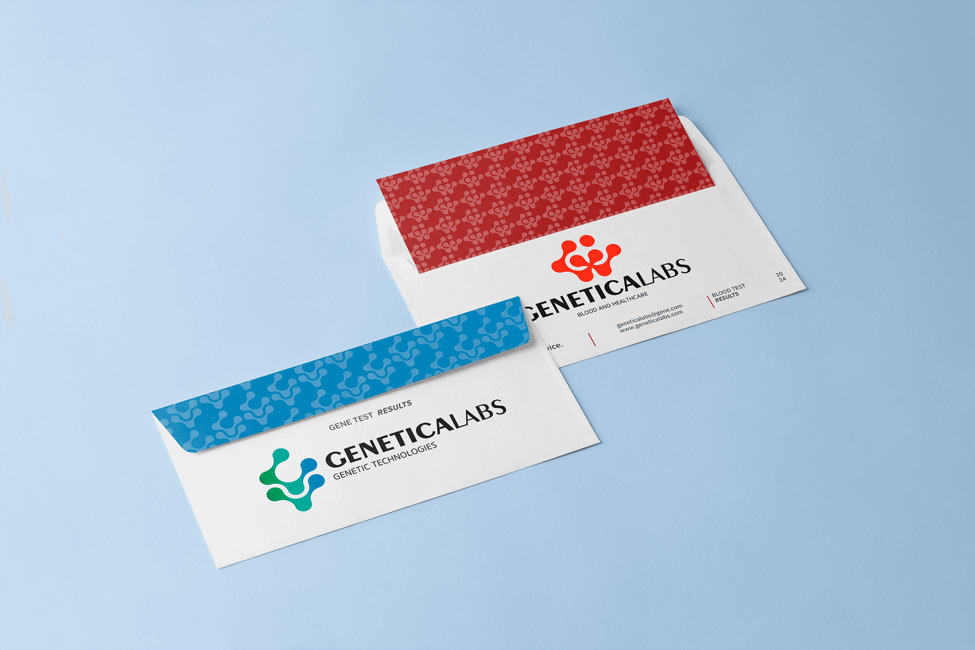
The visual identity project of Genetica Labs presents two complementary variations that represent different aspects of the services offered by the company. The first version, in warm tones (red-orange), is associated with the "Blood and Healthcare" division, conveying energy, vitality, and the human aspect of health care. The second version, in a green-blue gradient, represents the "Genetic Technologies" area, evoking technology, innovation, and growth.
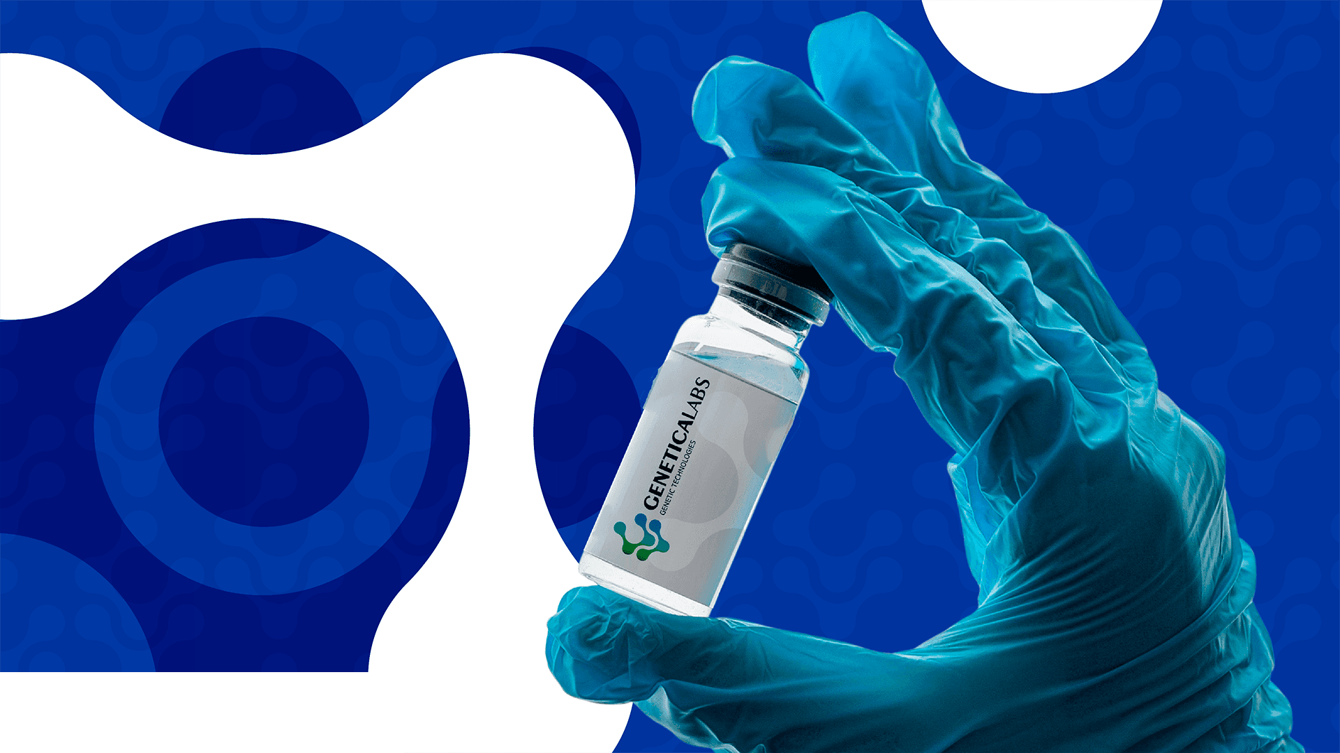
The symbol maintains its base structure in both versions - a shape that integrates molecular elements with connected human silhouettes - but adapts through the different color palettes to communicate the specificities of each division.
The complete color palette presents a harmonious transition from dark red to blue, passing through bright red, orange, and shades of green, creating a visual connection between the two areas of the company. This chromatic range symbolizes the diversity of services and the breadth of care.
(APPROACH)
The visual identity of GeneticaLabs was developed to reflect the two main areas of the company's operations, with a design that is both scientific and human. The use of different color palettes for each division allows the public to visually identify the focus of each service.
(VISION AND INNOVATION)
The brand aims to unite cutting-edge technology and humanized service, symbolizing this with an iconography that merges molecules and connected human forms.
The main challenge was to create a visual identity that was flexible enough to represent different services while maintaining a visual unity among the divisions.
(CLIENT NEEDS)
GeneticaLabs was looking for an image that communicated innovation and reliability, representing its commitment to health and biotechnology in a clear and impactful way.
